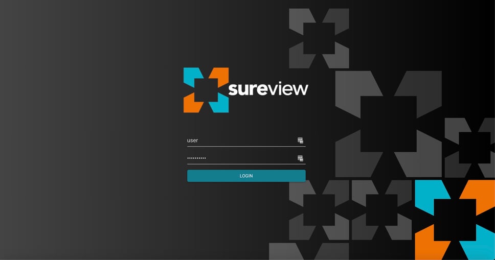
You have probably noticed that we have changed our logo and corporate branding. We recently split our business into two unique organizations: our Central Station customers will be serviced by the Immix brand and our Command Centers customers are simply under the name of SureView. We wanted to focus on making the two businesses unique so we reinforced this through a new brand design. We worked with the team at Analogous to come up with a fresh take on our company and its products.
Our new logo is at the heart of this new design—the aim was to design a logo with the following qualities: simple, memorable, timeless, versatile, and aligned with our values. The 4 corner shapes of the logo come together in the center to build a new shape—illustrating the essence of SureView, which is to connect different and divergent security systems into a single-pane-of-glass and with that, provide the frictionless, user-centric experience that our end-users have come to expect and that meets their operational needs.
The basic shape we worked with is the square because it communicates structure, stability, and at the same time, it is grounded. The use of positive and negative space communicates agility, innovation, and ease-of-use.
We also chose a new, vibrant, color scheme because our customers are becoming more dynamic and agile and as a result, so are we. The conservative colors that dominate the security market just did not deliver on the reality of the modern security operation.
We are all very excited about this new brand and the opportunities it gives us to better communicate our values. But at the end of the day, this is not just about fancy, new, graphics and colors, we are backing this up with exciting and innovative developments which we will be sharing with you in the days and weeks ahead.


