

In a crisis your response software needs to be easy to use
Not surprisingly when we talk to security executives about what happens in crisis situations they describe a picture where the collective “blood pressure” of the operation goes through the roof. Centers can quickly be overwhelmed with incoming calls, radio communications, alarms, sirens, managers in their ear; as you can imagine, it can soon become overwhelming for front-line operators.
You can’t eliminate the tension in a crisis—responding with urgency is part-and-parcel of crisis management and it is what operators are trained to do. But, what you can do is make things simpler for everyone.
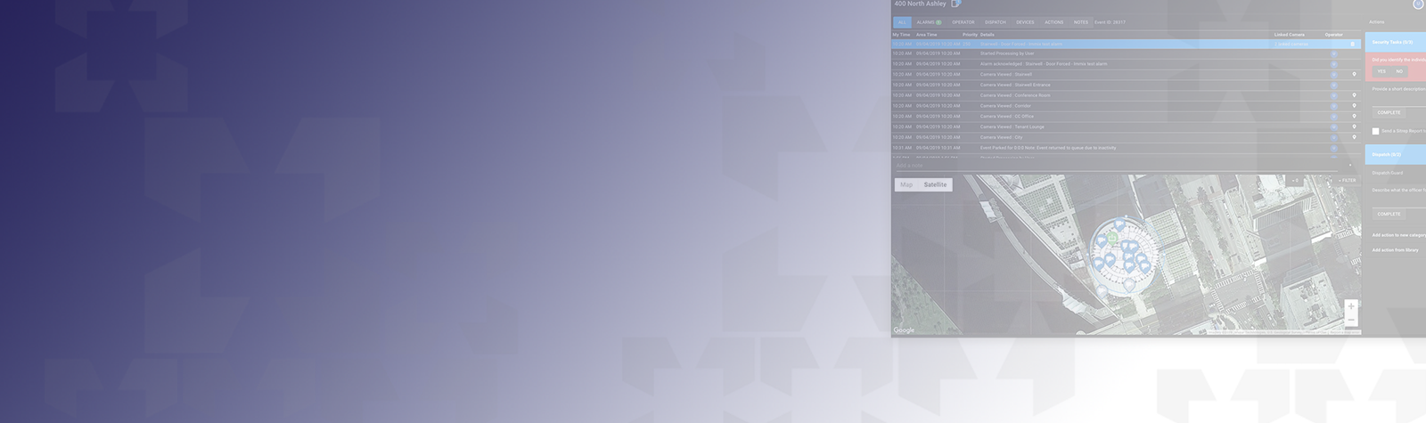
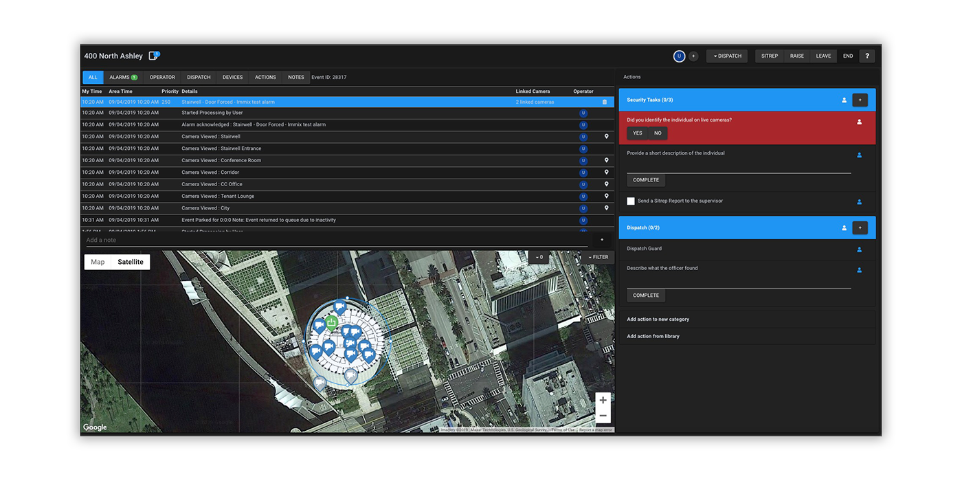
The operators window in a crisis
This is where application design plays such a fundamental role. The response interface operators use is their primary view into any evolving crisis. The design of this interface can make the operator’s job quicker, easier, more efficient, or it can make it even more stressful. There is almost unlimited data that can be presented to these operators in order to give them situational awareness. But is all of this data really helping them to identify the nature of the event and the best way to respond?
Immix’s Response Interface Defines Simple
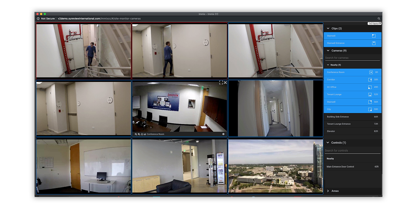
We recently redesigned the primary response interface of Immix CC. As part of this process we talked with our customers about their operations and crisis management. What was consistent is that the number of cameras, sensors, alarms, guards, etc is growing exponentially—the pace of technological developments are increasing every day. In the command center all of this data makes it difficult to see the forest for the trees.
Just what you need
We focussed our design on showing operators just the information relevant to the event. Sounds easy right? Of course it’s not. To tackle this problem, we looked at the interface through the lens of operator on their first day on the job. They have no institutional knowledge, they don’t know where anything is located or who is responsible for what. So with this in mind, we made the decision to only show operators data—floorplans, cameras, guards, assets—near to the originating alarm or event. To accomplish this we used mapping technology to automatically associate nearby devices and data to one another. No more long lists to scroll through or multiple systems to jump between. Of course, operators can easily expand the radius of the assets they want to see, but every event starts with a focused view.
With the core design principal in place we beta tested with our customers to make sure the user experience was simple and quick, providing the necessary data they need to respond in a crisis. It’s a never ending cycle of refinement, every new feature risks making the interface more complex so we have to constantly return to the original design mandate—showing operators just the information relevant to the event. If it was our first day on the job would we be able to respond to an escalating event? We want the answer to that question to be ‘yes’… everytime.

